Releases: Elius94/console-gui-tools
v3.0.4
What's Changed
Full Changelog: v3.0.3...v3.0.4
v3.0.3
What's Changed
- Update LayoutManager.ts by @FabianEscarate in #63
New Contributors
- @FabianEscarate made their first contribution in #63
Full Changelog: v3.0.2...v3.0.3
v3.0.2
Full Changelog: v3.0.1...v3.0.2
v3.0.1
Full Changelog: v3.0.0...v3.0.1
v3.0.0
New Major Release v3.x.x
Classes
- Box ⇐
Control
Interfaces
BoxConfig : Object
The configuration for the Box class.
Kind: global interface
Properties
| Name | Type | Description |
|---|---|---|
| id | string |
The id of the box. |
| x | number |
The x position of the box. |
| y | number |
The y position of the box. |
| [width] | number |
The width of the box. |
| [height] | number |
The height of the box. |
| [style] | BoxStyle |
The style of the box. |
| [visible] | boolean |
If the box is visible. |
| [draggable] | boolean |
If the box is draggable. |
BoxStyle : Object
The style of the box.
Kind: global interface
Properties
| Name | Type | Description |
|---|---|---|
| [boxed] | boolean |
If the box is boxed. |
| [color] | chalk.ForegroundColorName | HEX | RGB | "" |
The color of the box. |
| [label] | string |
The label of the box. |
Box ⇐ Control
Kind: global class
Extends: Control
new Box(config)
The class that represents a box.
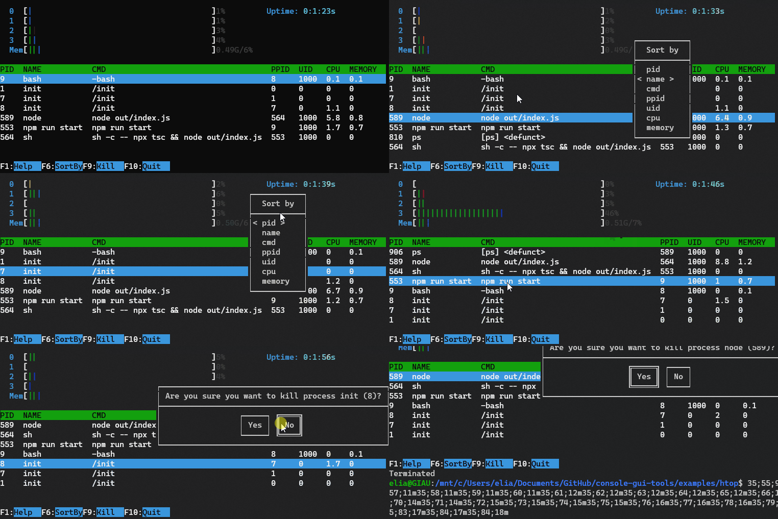
Example of a box containing a list of process running on the computer.
| Param | Type | Description |
|---|---|---|
| config | BoxConfig |
The configuration of the box. |
Example
const box = new Box({
  id: "box",
  x: 0,
  y: 0,
  width: 10,
  height: 5,
  style: { boxed: true, color: "red", label: "Box" }
})
box.setContent(new InPageWidgetBuilder(5).addText("Hello World!"))
The box is a control widget that allows you to create a box with a title and a content. The content is a InPageWidgetBuilder object, so you can add rows to it. It can have a title and can be boxed or not. It can be used to place some texts in a specific position of the screen, without using the layout. It also can be draggable.
new Box({
    id: "box1",
    x: 22,
    y: 3,
    width: 28,
    height: 3,
    draggable: true,
    style: {
        boxed: true,
    }
}).setContent(new InPageWidgetBuilder().addRow({ text: "This is a draggable Box!", color: "rgb(255,0,0)", bg: "rgb(0,0,255)"}))
See the Box documentation for more information. or try the Box example.
This example is inspired by the htop command line tool.
New Class Constructor Syntax
Since this release, every public constructor have now only one config prop with mandatory properties and others that are optional.
This is the full list of the affected classes:
- Box
- Button
- ButtonPopup
- ConfirmPopup
- Control
- CustomPopup
- FileSelectorPopup
- InputPopup
- OptionPopup
- ProgressBar
Migration Guide
To adapt the old syntax it's so simple:
Change the Class Constructor with only one object as props.
For example:
Before:
new ConfirmPopup("popupQuit", "Are you sure you want to quit?").show().on("confirm", () => closeApp())After:
new ConfirmPopup({
    id: "popupQuit",
    title: "Are you sure you want to quit?"
}).show().on("confirm", () => closeApp())
Other minor changes are:
- Added Errors generated if mandatory props are omitted
- Added Focus key to Console Gui (default "tab"). Now you can switch focus between controls by pressing this key
- Replaced all "\n" with os.EOL (depending by the platform). This constant is also exported by the main library as { EOL }
- Propagated to GUI The stdout on "resize" event
- introduced utils functions to change styled elem.
- Added an "htop" example (for demo)
- added unregister focus from others
- Added mouselistener to ConsoleManager Used to focus widgets that are not focused.
What's Changed
Full Changelog: v2.6.0...v3.0.0
v2.6.0
v2.5.0
Full Changelog: v2.4.2...v2.5.0
v2.4.2
Full Changelog: v2.4.1...v2.4.2
v2.4.1
Full Changelog: v2.4.0...v2.4.1
v2.4.0
Full Changelog: v2.3.3...v2.4.0

