- Fixes for Breadcrumbs plugin and list columns bullet alignment
This is a repository for modular CSS layout hack for use with Obsidian.md. It's meant to complement/assist Community Theme, focusing solely on providing alternative layout to standard width and standard top-bottom block view.
I mainly do casual test on select popular themes like ITS, Primary, Shimmering Focus, Prism, and Minimal. Need your help to let me know if there's anything not working right. Do log in MCL GH Issue if you find anything not working properly.
This is actually just a CSS code snippets collection. So it isn't an installation per se, but rather download and enable in Obsidian. The best way is to use Mara Li's Snippet Downloader plugin as I have plans to update this snippets from time to time
CSS snippet:
MCL Wide Views.css
This section only briefly explains Wide Views snippet. Please go through the documentation site Wide Views - Modular CSS Layout for more details.
This snippet provides you the following features:
- Full width page or blocks (dataview, table and backlinks) per page/note basis by specifying custom
cssClassat the frontmatter (YAML)wide-pagewide-dataview-- require Contextual Typography pluginwide-table-- require Contextual Typography pluginwide-calloutwide-backlinks- vault-wide toggle for each of the above
- Narrow width page per page/note basis for vault with RLL disabled by specifying custom
cssClassat the frontmatter (YAML)narrow-page
- Adjustable RLL (custom css class toggle) applicable to entire vault
- Disabled by default. Enable it via Style Settings plugin
For wide-dataview and wide-table, you will need to install Contextual Typography plugin.
---
cssClass: wide-page
---

<the rest of your note>CSS snippet:
MCL Multi Column.css
This section only briefly explains Multi Column snippet. Please go through the documentation site Multi Column - Modular CSS Layout for more details.
This snippet provides you the following features:
- Multi column layout using Callout
> [!multi-column]> [!blank-container]
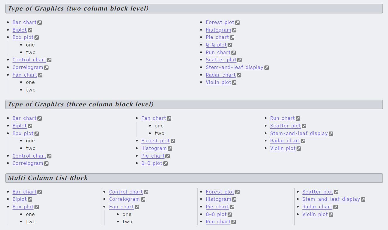
- Multi column layout using (Unordered) List
- it can be done via custom
cssClassat the frontmattertwo-column-listthree-column-listtwo-column-grid-listthree-column-grid-list
- it can also be done at block level (inside your note)
multi-column-list-block-- require Markdown Attributes plugin
- it can be done via custom
- Multi column layout using (Unordered) List AND tag (instead of css classes)
#mcl/list-column-- require Contextual Typography plugin#mcl/list-grid-- require Contextual Typography plugin#mcl/list-card-- require Contextual Typography plugin
- Side / Floating Column using Callout
> [!<anycallout>|<left|right>-<small|medium|large>]> [!blank-container||<left|right>-<small|medium|large>]
> [!multi-column]
>
>> [!note]+ Work
>> your notes or lists here. using markdown formatting
>
>> [!warning]+ Personal
>> your notes or lists here. using markdown formatting
>
>> [!summary]+ Charity
>> your notes or lists here. using markdown formatting
note that when you insert callout within callout, the line separating the callouts should only use single angle bracket (">")
CSS snippet:
MCL Gallery Cards.css
This section only briefly explains Gallery Cards snippet. Please go through the documentation site Gallery Cards - Modular CSS Layout for more details.
This snippet provides you the following features:
- Image gallery using callout by specifying the callout-metadata
gallerye.g.> [!NOTE|gallery] - Image gallery using YAML/frontmatter .
cssClass: image-gallery - Image and Mermaid Diagram Controls
- Dimension control for images in bullet list
- Image Zoom
- Mermaid Scale and Zoom
I do this on my free time for personal joy. However, a cup of coffee or two would motivate me further! If you like what I do, and want to contribute back, you can support me via Ko-fi


