forked from davidsjoberg/ggbump
-
Notifications
You must be signed in to change notification settings - Fork 0
/
README.Rmd
210 lines (155 loc) · 7.36 KB
/
README.Rmd
1
2
3
4
5
6
7
8
9
10
11
12
13
14
15
16
17
18
19
20
21
22
23
24
25
26
27
28
29
30
31
32
33
34
35
36
37
38
39
40
41
42
43
44
45
46
47
48
49
50
51
52
53
54
55
56
57
58
59
60
61
62
63
64
65
66
67
68
69
70
71
72
73
74
75
76
77
78
79
80
81
82
83
84
85
86
87
88
89
90
91
92
93
94
95
96
97
98
99
100
101
102
103
104
105
106
107
108
109
110
111
112
113
114
115
116
117
118
119
120
121
122
123
124
125
126
127
128
129
130
131
132
133
134
135
136
137
138
139
140
141
142
143
144
145
146
147
148
149
150
151
152
153
154
155
156
157
158
159
160
161
162
163
164
165
166
167
168
169
170
171
172
173
174
175
176
177
178
179
180
181
182
183
184
185
186
187
188
189
190
191
192
193
194
195
196
197
198
199
200
201
202
203
204
205
206
207
208
209
210
---
output: github_document
---
<!-- README.md is generated from README.Rmd. Please edit that file -->
```{r, include = FALSE}
knitr::opts_chunk$set(
collapse = TRUE,
echo = TRUE,
comment = "#>",
fig.path = "man/figures/README-",
out.width = "100%",
dpi = 800
)
```
# ggbump <img src="man/figures/logo.png" align="right" />
<!-- badges: start -->
[](https://www.tidyverse.org/lifecycle/#maturing)
[](https://CRAN.R-project.org/package=ggbump)
[](https://github.com/HaydenMacDonald/ggbump/actions)
[
<!-- badges: end -->
The R package `ggbump` creates elegant bump charts in ggplot. Bump charts are good
to use to
plot ranking over time, or other examples when the path between
two nodes have no statistical significance. Also includes functions to create
custom smooth lines called sigmoid curves.
## Installation
You can install ggbump from CRAN with:
``` r
install.packages("ggbump")
```
Or the latest development version from [github](https://github.com/davidsjoberg/ggbump) with:
``` r
devtools::install_github("davidsjoberg/ggbump")
```
## Bump chart examples
Basic example:
```{r main_plot, fig.height=3, fig.width = 9, echo = FALSE, warning=FALSE, message=FALSE}
if(!require(pacman)) install.packages("pacman")
pacman::p_load(tidyverse, cowplot, wesanderson, ggbump)
df <- tibble(country = c("India", "India", "India", "Sweden", "Sweden", "Sweden", "Germany", "Germany", "Germany", "Finland", "Finland", "Finland"),
year = c(2011, 2012, 2013, 2011, 2012, 2013, 2011, 2012, 2013, 2011, 2012, 2013),
rank = c(4, 2, 2, 3, 1, 4, 2, 3, 1, 1, 4, 3))
ggplot(df, aes(year, rank, color = country)) +
geom_point(size = 7) +
geom_text(data = df %>% filter(year == min(year)),
aes(x = year - .1, label = country), size = 5, hjust = 1) +
geom_text(data = df %>% filter(year == max(year)),
aes(x = year + .1, label = country), size = 5, hjust = 0) +
geom_bump(size = 2, smooth = 8) +
scale_x_continuous(limits = c(2010.6, 2013.4),
breaks = seq(2011, 2013, 1)) +
theme_minimal_grid(font_size = 14, line_size = 0) +
theme(legend.position = "none",
panel.grid.major = element_blank()) +
labs(y = "RANK",
x = NULL) +
scale_y_reverse() +
scale_color_manual(values = wes_palette(n = 4, name = "GrandBudapest1"))
```
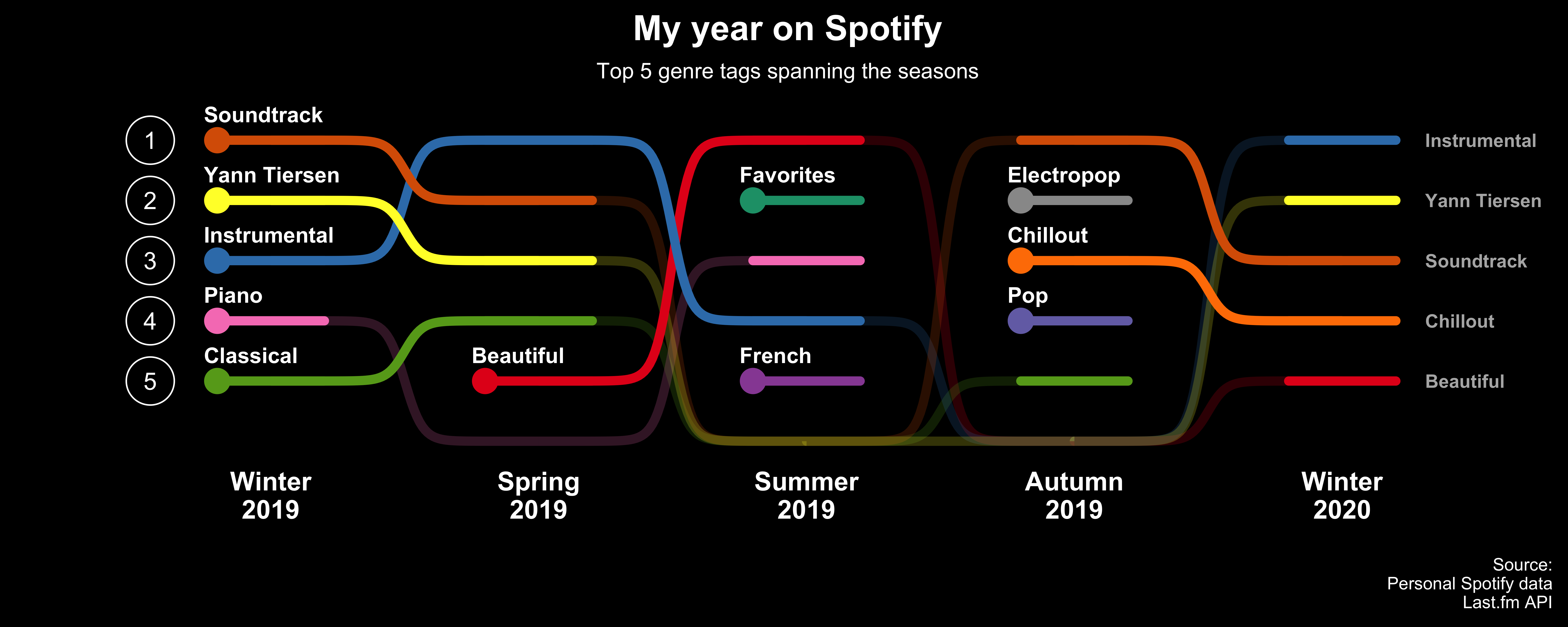
A more advanced example:

[Click here for code to the plot above](https://github.com/davidsjoberg/ggbump/wiki/My-year-on-Spotify)
Flags could be used instead of names:

[Click here for code to the plot above](https://github.com/davidsjoberg/ggbump/wiki/geom_bump-with-flags)
## Sigmoid curves examples
With `geom_sigmoid` you can make custom sigmoid curves:

[Click here for code to the plot above](https://github.com/davidsjoberg/ggbump/wiki/geom_sigmoid)
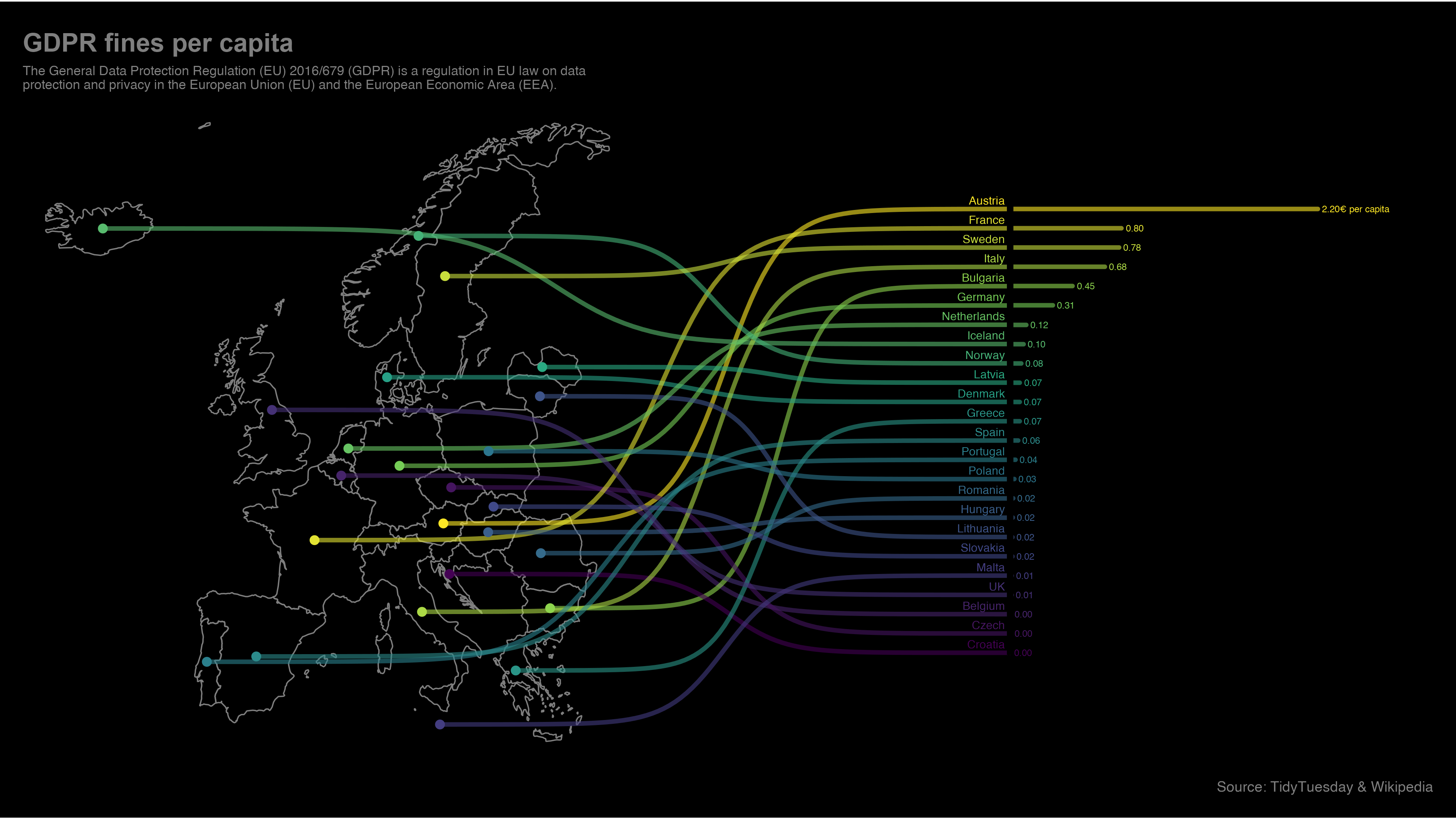
With `geom_sigmoid` you have the flexibility to make more complex plots:

[Click here for code to the plot above](https://github.com/davidsjoberg/tidytuesday/blob/master/2020w17/2020w17_skript.R)
# Tutorial
## Prep
Load packages and get some data with rank:
```{r data}
if(!require(pacman)) install.packages("pacman")
library(ggbump)
pacman::p_load(tidyverse, cowplot, wesanderson)
df <- tibble(country = c("India", "India", "India", "Sweden", "Sweden", "Sweden", "Germany", "Germany", "Germany", "Finland", "Finland", "Finland"),
year = c(2011, 2012, 2013, 2011, 2012, 2013, 2011, 2012, 2013, 2011, 2012, 2013),
value = c(492, 246, 246, 369, 123, 492, 246, 369, 123, 123, 492, 369))
knitr::kable(head(df))
```
To create a ranking column we use `rank` from base R. We specify `ties.method = "random"` to make sure that each country have different rankings if they have the same value.
```{r}
df <- df %>%
group_by(year) %>%
mutate(rank = rank(value, ties.method = "random")) %>%
ungroup()
knitr::kable(head(df))
```
## Make a bump chart
Most simple use case:
```{r pressure, echo = TRUE, fig.height=3, fig.width = 9}
ggplot(df, aes(year, rank, color = country)) +
geom_bump()
```
## Pimp the bump chart!
Improve the bump chart by adding:
* A point for each rank observation.
* Choose a minimal theme, I use `theme_minimal_grid()` from `cowplot`.
* Choose nice colors so it does not look generic ggplot. I use a palette from `wesanderson`.
* Remove legend and add labels at the start and end of the bumpy ride.
* Reverse the y-axis to get rank 1 at the top.
* Adjust the 'smoothness' of the lines by setting `smooth` to 8. Higher means less smooth.
```{r, fig.height=3, fig.width = 9, echo = TRUE}
ggplot(df, aes(year, rank, color = country)) +
geom_point(size = 7) +
geom_text(data = df %>% filter(year == min(year)),
aes(x = year - .1, label = country), size = 5, hjust = 1) +
geom_text(data = df %>% filter(year == max(year)),
aes(x = year + .1, label = country), size = 5, hjust = 0) +
geom_bump(size = 2, smooth = 8) +
scale_x_continuous(limits = c(2010.6, 2013.4),
breaks = seq(2011, 2013, 1)) +
theme_minimal_grid(font_size = 14, line_size = 0) +
theme(legend.position = "none",
panel.grid.major = element_blank()) +
labs(y = "RANK",
x = NULL) +
scale_y_reverse() +
scale_color_manual(values = wes_palette(n = 4, name = "GrandBudapest1"))
```
## geom_bump with factors (development version only)
You can use `geom_bump` with factors or character as x axis. Just remember to keep an eye on factor order.
```{r, fig.height=2.5, fig.width = 7, echo = TRUE}
# Original df
df <- tibble(season = c("Spring", "Pre-season", "Summer", "Season finale", "Autumn", "Winter",
"Spring", "Pre-season", "Summer", "Season finale", "Autumn", "Winter",
"Spring", "Pre-season", "Summer", "Season finale", "Autumn", "Winter",
"Spring", "Pre-season", "Summer", "Season finale", "Autumn", "Winter"),
rank = c(1, 3, 4, 2, 1, 4,
2, 4, 1, 3, 2, 3,
4, 1, 2, 4, 4, 1,
3, 2, 3, 1, 3, 2),
player = c(rep("David", 6),
rep("Anna", 6),
rep("Franz", 6),
rep("Ika", 6)))
# Create factors and order factor
df <- df %>%
mutate(season = factor(season, levels = unique(season)))
# Add manual axis labels to plot
ggplot(df, aes(season, rank, color = player)) +
geom_bump(size = 2, smooth = 20, show.legend = F) +
geom_point(size = 5, aes(shape = player)) +
theme_minimal_grid(font_size = 10, line_size = 0) +
theme(panel.grid.major = element_blank(),
axis.ticks = element_blank()) +
scale_color_manual(values = wes_palette(n = 4, name = "IsleofDogs1"))
```
## Feedback
If you find any error or have suggestions for improvements you are more than welcome to contact me :)