-
Notifications
You must be signed in to change notification settings - Fork 2
New issue
Have a question about this project? Sign up for a free GitHub account to open an issue and contact its maintainers and the community.
By clicking “Sign up for GitHub”, you agree to our terms of service and privacy statement. We’ll occasionally send you account related emails.
Already on GitHub? Sign in to your account
AdminThemeUikit: longer page titles collide with sub-nav arrow #764
Comments
|
Experience the same. |
|
Seems like there should be a simple css adjustment that could resolve this, but I've not been able to track one down yet. |
|
.ui-menu .ui-menu-item a i.fa currently has margin-left: -2px, changing that to a positive number is working for me so 5px. The plus to the left of the items has margin-right: 5px applied by .pw-nav-icon so thats why I went for that. |
|
Although that change will add 5px to the left of the magnifying plus, but that should get you along the right lines, basically just need to add a left margin to the font awesome angle-right. |
|
@postscript-chris Thanks. That does seem to solve it, but strangely it screws up ajax loaded dropdowns, which start loading on top of each other. I don't really understand why. But I tried adding the 5px as padding to the i.fa item instead, and now that seems to solve it without side effects as best as I can tell. I also had tried applying these things before but using the browser inspector, and it wasn't working (was screwing things up) but applying them to the original .less files seems to work. There must be some dynamic aspect to the jQuery ui-menu items that makes it not play nicely with live changes from the browser. |
That seems like a good solution to me. Although personally I'd prefer a little more space between the text and the "has items" icon - 10 pixels looks about right to my eye. Added the padding here... .ui-menu .pw-has-items-icon {
float: right;
margin-top: 4px;
padding-left: 10px;
} |
|
The padding makes the AJAX spinner wonky, so an extra rule is needed: .ui-menu .pw-has-items-icon.fa-spinner {
padding-left: 0;
} |
|
@ryancramerdesign Hi Ryan, wonder if you could review Robin's suggested fix above? |
|
I've modified my CSS fix for this. I'm now overriding the CSS like this: .ui-menu .ui-menu-item a { padding-right:28px; }
.ui-menu .pw-has-items-icon { position:absolute; right:7px; }
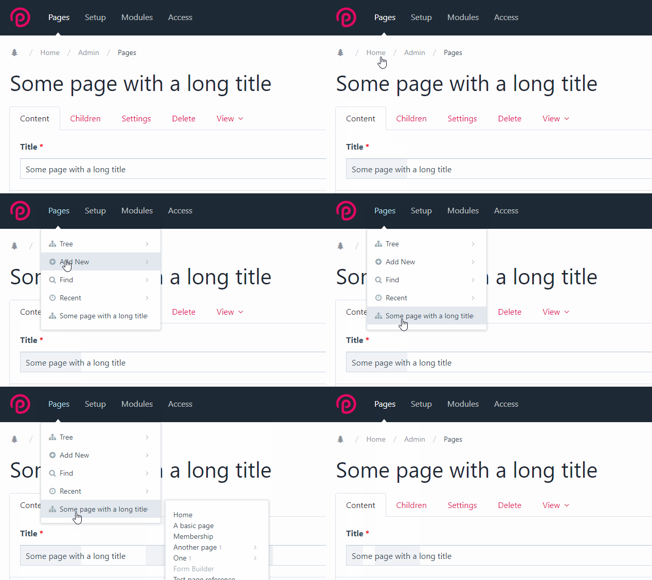
.ui-menu .ui-menu-item a i.fa.fa-spinner { right:3px; }3.0.152 core - besides the icon collision note the shift when the spinner appears and the gap to the left of the flyout submenu: With CSS override: |


Short description of the issue
A minor styling issue in AdminThemeUikit: longer page titles can collide with the sub-nav arrow icon for Process modules with sub-navigation.
Setup/Environment
The text was updated successfully, but these errors were encountered: