-
Notifications
You must be signed in to change notification settings - Fork 31
Graphical Principles
cschaerfe edited this page Jan 8, 2020
·
1 revision
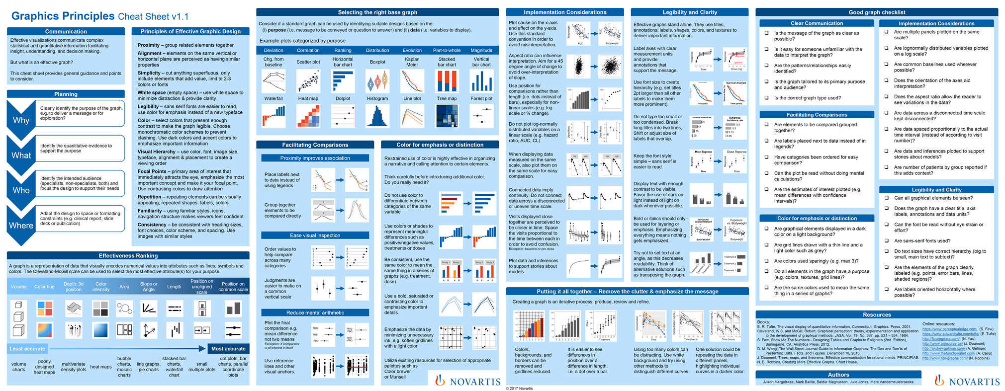
Insights from data can best be gleaned by visualising the results of analytical questions using both tables and figures. The effectiveness of these visuals can vary drastically and much theoretical work has been built around how to best communicate using graphics.
The problem often lies in implementing those principles in the busy daily work of data science. Here, the cheat sheet developed by quantitative scientists at Novartis can help adhere to the most important aspects. Our visR package will also help implement the best practices summarized in the cheat sheet.
You can find the cheat sheet and related code on https://graphicsprinciples.github.io/
