Youth, high-school, and amateur sporting events take place in many locations. Friends and family members of athletes will often travel to towns and cities they are not familiar with to watch and support the athletes. For example, a typical high-school basketball team will play roughly half its games “on the road” - away from the “home” location, gymnasium, field, etc. These trips are rarely longer than a single day, and in many cases last only a few hours. Everyone is busy - parents, kids, siblings, friends, athletes, and the coaches - and with such short trip durations, extensive planning is frequently not worth the effort.
Coaches and athletes would like friends and families to have enjoyable experiences when they travel to support athletes. The coach is frequently the center point of all the communication to athlete and athlete’s families, and as a result may get frequent questions similar to “Where’s a good place to eat after the game ?”. The problem is that coaches don’t have a simple way to provide a “local guide” for each location on the schedule, and usually don’t have the staff or time available to do this manually.
The core questions from a coach's perspective:
(1) Which locations on the schedule have the most options and least options for friends and families ? Specifically for food, coffee, snacks, etc - services that would be useful for friends and families either before or after a sporting event.
(2) Can each location be labeled in a way to indicate if additional planning is prudent or pragmatic? These labels would convey total options available at given location to help friends and families in their travel planning. If there are many options, little additional planning needs to be done; If there are few options, significant additional planning might be needed.
(3) Provide a selection of a few the most popular or highly recommended venues in each location.
Answering these questions enables a coach to provide information to assist athletes and their friends and families in travel planning for upcoming sporting events.
Organizations like prep schools, will draw families and students from a wide geographic area. Amateur endurance athletes competing in sports like marathons and triathlons will often use online coaching. In both cases, “local knowledge” about the “away” locations may be unavailable to the coaches, athletes and their families; leaving recommendations for simple things like "where to eat" hard to find.
“We’ll figure it out when we get there”, is a perfectly fine strategy for locations with many food and shopping options, but for locations with very few options, this can result in an unpleasant trip. Informing friends and families which sporting event locations need additional planning will help reduce the stress associated with travel.
The following data is required:
-
Location Information of each sporting event.
- Data type is a text, in the form of City & State; e.g. Lawrence Academy, Groton, MA, or Skeetwater Triathlon, Lithia Springs, GA, or Boston Marathon, Boston, MA
-
Latitude & Longitude for each sporting event location.
- Data type is a pair of decimal numbers, as in (42.604433, -71.5628436838169)
-
Venue Information for restaurants, shops, services surrounding each sporting event location.
- Venue Name, Venue Location (Latitude & Longitude), Venue Category, Venue Parent Category. (See Sources for information)
-
Category Tree to map each individual category to a “roll-up” parent category type. For example “Pizza Place” will roll-up to “Food”.
- Tree structure of all categories describing how they relate to each other.
-
Estimated Driving Distance and Duration from “Home Location” to each event
- Estimated Driving Distance in meters (will convert to other units for reporting)
- Estimated Driving Duration in seconds (will convert to other unites for reporting)
High level constraints on collecting data:
-
It must be no-cost. There is no budget for this project, so data available from paid sources was not considered.
-
It is only North American data. There is nothing explicitly exclusionary about the data collection for this project. However, nothing outside the Northeastern United States was included in the analysis; therefore, this analysis may not be transferrable to other geographic locations.
-
Sporting Event Locations
The data was collected from the 2018-2019 Varsity Girls Basketball Schedule of Cushing Academy, a nearby College Prepatory School. A custom web-scraper was built to collect the information from the team page -
Sporting Event Location Geocoding
The latitude and longitude of each school location was collected from Open Street Maps Nominatim geocoding service. For Reference: The API information. -
Venue Information & Category Tree
Venue information is collected from the Foursquare APIThe category tree is also accessible from Foursquare.
Specific data types and attributes for venues or categories can be explored in the Foursquare Documentation
-
Routing information
Routing information (Estimated Driving Distance and Estimated Driving Duration) is provided by Open Source Routing Machine Project.
This section details specific issues, decisions, and assumptions that might have impacted data collection or cleansing.
The Sporting Event Location data had several records that required manual data correction. The web-scraped extraction of event location data did not include City and State designation. As a result the geocoding service return incorrect latitude and longitude. For example, searching for “St. George’s School”, returns a school in England. Even revising the search term to include country code (US in this example), did not ameliorate the issue. The modified search with country code returns a school in California.
Using domain knowledge that all games for Cushing Academy are regional, the cleansing strategy was to group all sporting event locations by city and state. Unintended results provided by the geocoding service were easily identified; for example, results like England, North Carolina, Pennsylvania are not regional to Cushing Academy and are clearly in error. Using Google I looked up the correct city and state for schools and modified the search term and updated the dataset with the correct latitude and longitude.
Limiting the search area around a location.
The search radius around each location is 2.5 miles.
This distance was chosen as how far is it likely someone can travel from location in 10 minutes.
10 minutes was chosen based on the assumption most travelers would like to get back on the road as quickly as possible, while also driving as long of a segment as possible on the trip home. “Eat quick and hit the road”, if you will. Therefore restaurants and shops should be very close to the event location.
School zones speed limits are typically in the range of 15mph to 25mph. Since our event location list is from a High School sports schedule, most locations will also be schools. Also including that these are events - it is possible there will be hundreds to thousands of other people also attending these sporting events. Minor Congestion around the event location (parking lots, etc) might also impact the driving speeds. Allocating 2 minutes for walking to car, getting out of the parking lot, etc, leaves 8 minutes. At 15 mph, you can travel 2 miles in 8 minutes; at 25 mph, you can travel 3.3 miles. While not the midpoint, 2.5 miles was chosen as a good radius to comply with “Eat quick and hit the road” desires.
Limiting the number of venues
The analysis is limited to 100 venues per location.
The judgement is that the additional information beyond 100 venues will not impact the primary purpose of the analysis, which is to indicate locations that require extra planning. Consider the thought experiment, location A has 100 venues, location B has 3 venues. If a game next month is at location A, it is low-risk to “wing-it, and pick something when we get there”. Is the relative change in risk for a location with venue counts of 100 vs 200 venues impactful ? So long as locations such as location B are in the dataset , the difference within the same order of magnitude (100 vs 200), are insignificant compared to the changes in risk when orders of magnitude change (1 vs 10 vs 100 vs 1000). That is, the difference between 3 venue options and 100 venue options is significantly (and practically) more impactful to the families traveling than the difference between 100 and 200 venues. The purpose of the model is to indicate that locations, such as location B, will require significantly more research than location A to find a “good place to eat.” Thus, the decision is that extra information beyond 100 venues will not impact the quality of the recommendations.
Category Mapping to a Parent Category
Foursquare provides the complete set of category information in a tree structure. For example, if a venue is categorized as a “Multiplex”, that category is a child of the “Movie Theater” category, which is a child of “Arts & Entertainment”, which is a top-level category in Foursquare. As part of the analysis, all children categories are mapped to the top-level parent. Continuing the example, “Multiplex” will be mapped to “Arts & Entertainment”, in effect flattening the tree, and losing the “middle child” of “Movie Theater”. For completeness, that middle child, “Movie Theater” is also mapped to the top-level parent category. All categories have been mapped to one of the 10 top-level categories.
The analysis is based on a convenience sampling of one nearby Prep School. It is possible that any conclusions learned on this data set won’t be transferrable to other locations.
In the context of a “League” or “Conference”, where multiple similar institutions compete agains each other, form youth soccer to high-school volleyball, There are two clear situations where this convenience sampling will represent other locations. When those locations are:
- High Population density
- Very low population density
For high-population density areas, there will be many opponents within a confined geographic area, so the lack of “local knowledge” may not be an issue, as travel distances may not even take you out of the neighborhood. In some cities, an away game, might only 20 be blocks away. There is very little planning required when traveling 20 blocks.
For low-population density areas, it is unlikely to be surprised as everyone already knows there are few options. The expectation of having 20 or 30 dining options to choose from is not present.
In a nutshell for “leagues” within homogenous geographic areas, either high or low population densities, the usefulness of a planning tool is greatly reduced, as it is unlikely for a location to be outside expectations.
It is clear the approach in this analysis is not universally applicable. However, there are many situations where people choose to travel to a diverse set of locations, or the location in question is sufficiently far away that a simple tool to judge the amount of planning required before travel is useful. In my opinion, the convenience sample in this analysis does in fact represent a large population.
The heart of the primary research questions might be restated as, how to describe a location that informs the planning requirements before travel. This perspective drives the analysis to be focused on descriptive models and patterns. The outcome therefore, is a way to describe multiple locations in a way that is consistent across diverse population context to enable quick decisions supporting travel planning.
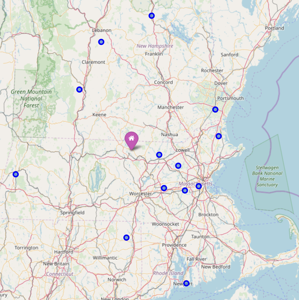
A basic map of the region was used to get a visual feel for the locations in the dataset are located. The high school chosen as a data source travels as far south as Rhode Island, as far West as Massachusetts border, nearing New York, and fairly far north into New Hampshire. On the positive side there is a great diversity in this location set, very rural settings to very urban settings.
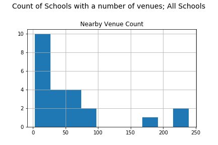
The venue date set contains a 1,037 venues, for 23 locations. The data has a right-skew. Many locations have few venue options, while a few locations have many venue options. This right-skew might impact the clustering.
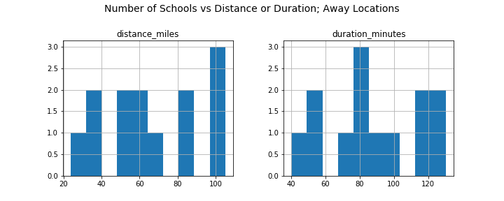
There are two dimensions when analyzing travel, distance and duration.
The distance and duration plots seem like they will cluster relatively smoothly. The data does not have a dominate skew right or left. No bin in the histogram has more than 5 locations. This data should not be too challenging to work with.
One of the goals of this analysis is to assign labels to groups of locations which indicate how many venues will be useful to travelers. This naturally leads for a heavy bias towards “Food” venues.
Foursquare has 10 Top-Level categories and the data has been rolled to the highest level. It is possible to then cluster on 10 features, one for each top-level category. However, the dataset only has data for 8 top-level categories. That is, there are no venues for the following Top-Level categories Professional & Other Places or Residences.
Knowing that “Food” will hold the most sway begs the question, will using all 8 features result in over-fitting the model ? Or even more pragmatically, is there benefit to the added sophistication ?
Since a single feature carries more weight, perhaps a simple cut (binning) approach will be "good enough". Will clustering on what appears to be low value features impact the accuracy ?
To explore these questions 4 different models were run:
- Binning, with 3 bins
- Binning, with 4 bins
- K-Means, with k=3
- K-Means, with k=4
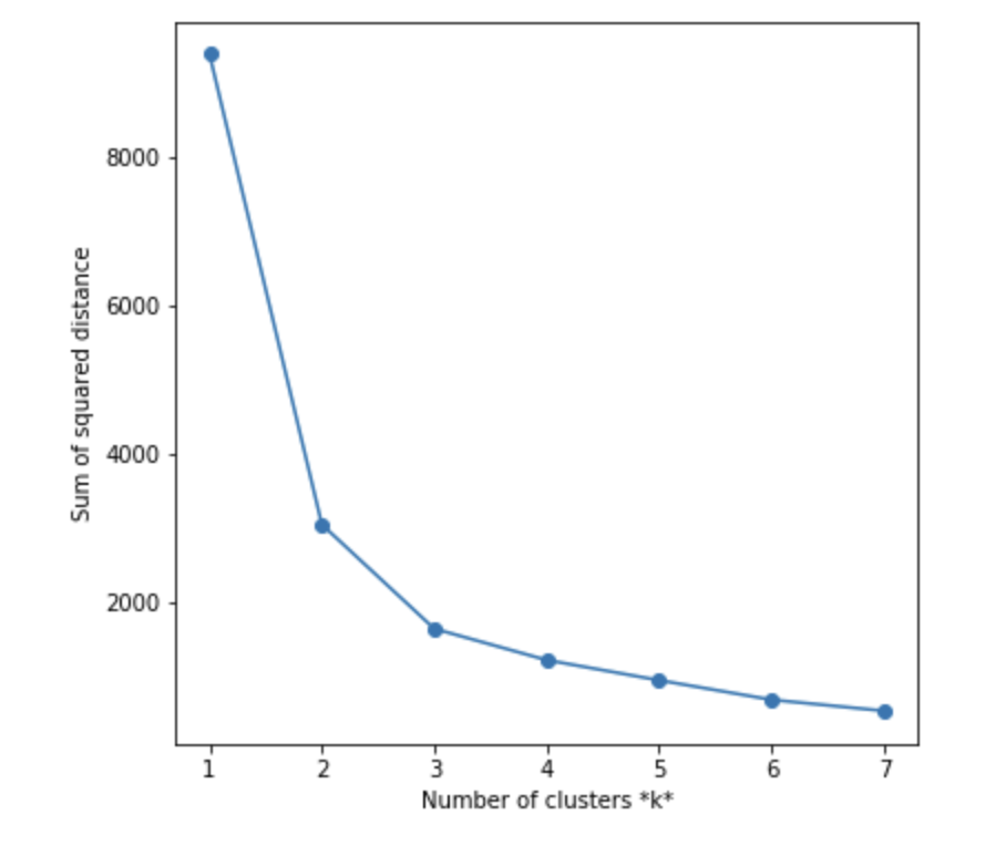
NOTE For K-Means an "elbow" analysis was completed.
The plot of multiple K-values shows that k=3 would be considered the recommended choice.
Model Evalutaion
Since binning, won't feed into standard model evaluation tool, the following methodology was used for model comparisons.
- Average "Weight" of the cluster
- Clustering "Balance"
The calculation for Weight of a cluster is calculated by taking the difference between the location with most venues and the location with least venues and multiplying by the number of locations in that cluster. Then find the average cluster weights for all clusters in that model. The lower the "Average Weight", the more densely packed the clusters are.
Clustering "balance" is calculated by difference is maximum cluster size and minimum cluster size. It will be of little pragmatic use, if the cluster doesn't create subdivision with in the data set. To illustrate this point, image 3 clusters in the model, cluster "A" has 1 location, cluster "B" has 1 location, cluster "C" has 22 locations. This model doesn't really help you plan. For this metric, smaller is preferred.
| Model | Avg. Weight | Balance |
|---|---|---|
| Binning (bins=3) | 114.0 | 8 |
| Binning(bins=4) | 54.75 | 6 |
| KMeans(k=3) | 114.0 | 8 |
| KMeans(k=4) | 54.25 | 4 |
Its clear the model configuration with cluster / bucket size = 4, outperformance cluster / bucketloads size of 3. And K-Means, K=4 appears to have more balanced model. Lets look at the two leading models.
This table compares the venue options label with count of locations with that label. That is, how many locations have very few options (== Slim Pickins)
| Label | KMeans(k=4) | Binning(bins=4) |
|---|---|---|
| Slim Pickins | 8 | 10 |
| A Few | 5 | 5 |
| Some | 6 | 4 |
| Lots | 4 | 4 |
K-Menans(k=4), is the best model in the analysis and is used to assign the labels for all clusters.
Two additional types of data were collected.
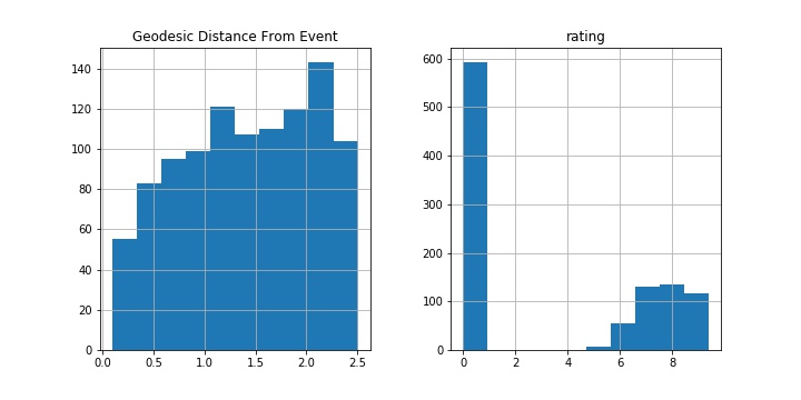
- Geodesic Distance from Venue to Event Location. Which is the shortest distance "as the crow flies" to the event location
The further you get from an event location, the more options there tends to be. This is not surprising since the data set is list of high schools, and most high school campuses do not have many external venues operating on the campus. I would expect this pattern to be true of many event locations.
- Venue Ratings
With the limited access to the premium Foursquare API, most venue's do not have any rating data. At this time, due to the large amount of missing data, no analysis will incorporate rating data.
The approach was generally useful and it is easy to tell which locations require additional planning would be pragmatic. Below is a table of all the results, pulling in the label for how far the drive is, combined with the location labels from the K-Means(k=4) model.
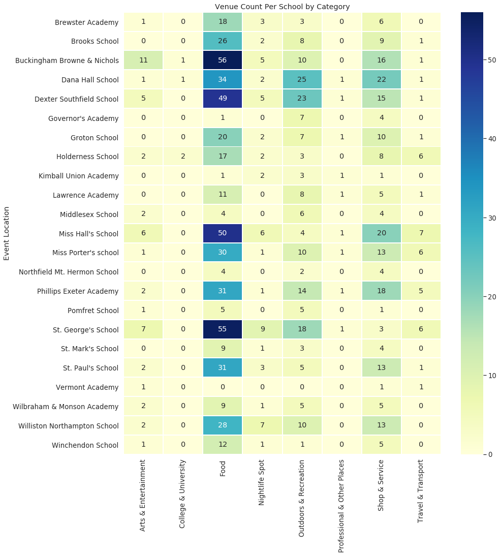
Below is a heatmap of all locations in the dataset. It is easy to see the diversity of different locations, so having a short-hand mechanism to group them is useful.
This analysis is an interesting start to this problem space. Ideally, I'd like to work closely with families and coaches, to make sure the visuals are useful to the actual end-users.
This analysis should be repeated for a different type of event list, perhaps marathons or a club track-tream, to see if the event locations for other sports conform to the challenges of travel planning explored in this analysis.
Processing the routing information led me to consider it might be more useful to personalize this analysis based on the location of the actual families, instead of the "Home Location" of the gym. However, in order to do that, dramatically expands the scope of the data collection and route generation.
Similar to routing personalization, I can envision more personal preferences for venue selection being useful; such as filtering by diet type (vegan, gluten-free, etc)
The last improvement that came to mind was different route preferences and optimizations. The current assumption is that travelers want the 'longest segment possible', and thus venues near one of the end-points of the trips are preferred. Different travel optimizations would be a nice feature, such as ‘breaking the trip in half’, or 'adding a stop to see a friend on the way'.
Given the limited scope and budget of this project, the analysis produced interesting and useful results with many avenues to continue this work into the future.
