Releases: javiersantos/MaterialStyledDialogs
Releases · javiersantos/MaterialStyledDialogs
Version 1.5.2
Release 1.5.2
Version 1.5.1
- Added
.withDarkerOverlay()to show a gray/darker overlay to the header. - Update SDK and Gradle.
Version 1.5
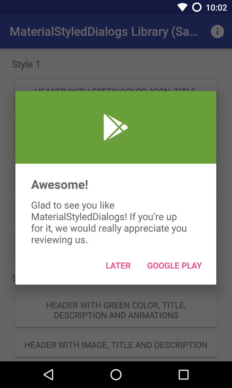
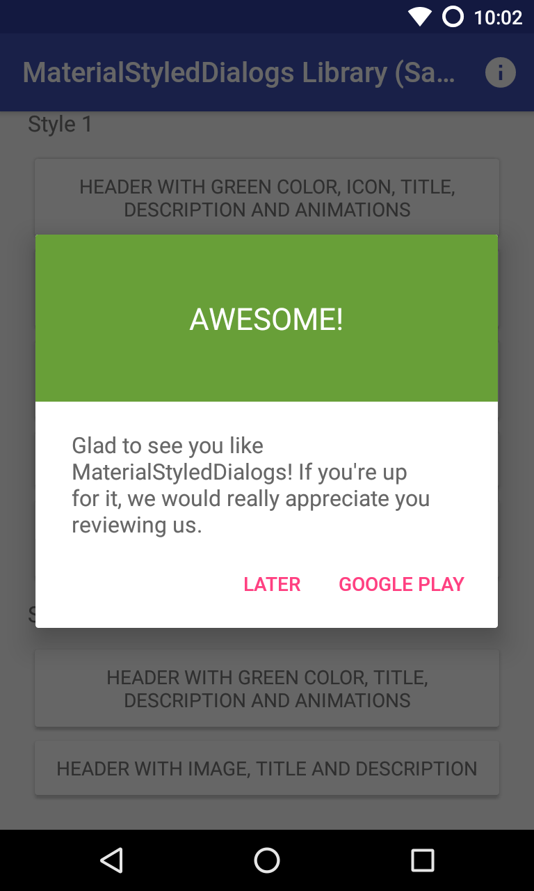
- Added new style with title as the header:
Style.HEADER_WITH_TITLE.
 |
 |
|---|---|
Header with Icon (default): .setStyle(Style.HEADER_WITH_ICON) |
Header with Title: .setStyle(Style.HEADER_WITH_TITLE) |
- Update material-dialogs library.
- Update gradle and buildTools.
Version 1.4.1
- Some improvements when adding an image as the header. It will be cropped to fit the header size.
Version 1.4
- Set the custom view with some padding in DP using the
.customView(View view, int left, int top, int right, int bottom). - Divider is now optional and invisible by default. Using the
.withDivider(boolean)method you can manage the divider visibility. - Minor changes to the dialog layout.
Version 1.3.1
- Fixed #9: remove dark background when a dark
?android:textColorPrimarycolor in style is applied. - Update gradle and libraries.
Version 1.3
- Set a custom view to the dialog using the
.setCustomView(View)method. Thanks to @kobihcmomanyi.
Documentation available here: https://github.com/javiersantos/MaterialStyledDialogs/wiki/Adding-a-custom-view
Version 1.2.2
- Fixed a RuntimeException on devices with a small screen (less than 470dp x 320dp).
Version 1.2.1
- Update AppCompat to 23.2.0
Version 1.2
- Added
setScrollable(Boolean)andsetScrollable(Boolean, Integer)methods to enable description with a vertical scrollbar. - Added
dismiss()method to close the current dialog. - Fixed blank description when a custom style with
android:textColorPrimaryis different from the default value.