-
Notifications
You must be signed in to change notification settings - Fork 8
New issue
Have a question about this project? Sign up for a free GitHub account to open an issue and contact its maintainers and the community.
By clicking “Sign up for GitHub”, you agree to our terms of service and privacy statement. We’ll occasionally send you account related emails.
Already on GitHub? Sign in to your account
Flood Realtime : The circle seems like representing something wrong #92
Comments
|
@ivanbusthomi - would you like to see if you can replicate this on the desktop please and confirm what the numbers should be |
|
With the template replication, i would also suggest that we can use some tidier ranges for the symbols since we always have the same population in one area. Maybe <50,000; 50,000 - 100k; 100k - 150 k, 150 - 200k, > 200k (mutually exclusive if possible :) |
|
is it possible to see an example of a report from the #93 ? @ivanbusthomi - can you please test this on the desktop so we can provide advise to the developers on the required behaviour? |
|
Hi @Charlotte-Morgan For the circle, I am still working on that. It should be only a matter of changing the style. I have tried it, but the report is still using the old breakdown. |
|
@ismailsunni do you still have issues by changing the style? IIRC I also did fixed it. |
|
The last time I tried, it still didn't get applied to the report. I am not really sure why. The range of the circle is still the same. |
|
status update @ismailsunni ? |
|
I am not working anymore on this issue since my last comment, I checked it, it's still the same: http://realtime.inasafe.org/realtime/flood/impact-map/2018021505-6-rw/en/ |
|
agreed, still seems to be the case @lucernae e.g. http://realtime.inasafe.org/realtime/flood/impact-map/2018021505-6-rw/en/ Also, population symbols are missing from some flooded areas |
|
@myarjunar This needs to be fixed in Realtime v4 :D |
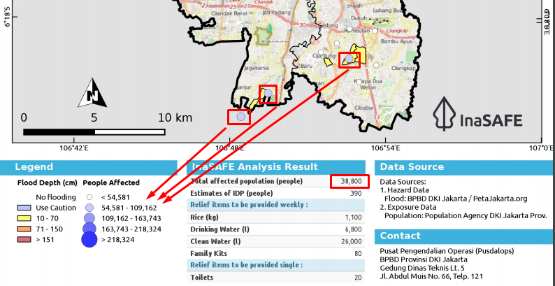
If we see the picture below, seems like there is something weird about the symbology

As we know, the circle on the map representing the number of people affected in every village.
In the picture above, we can see 3 blue circles on the map.
Refers to the map legend, that circle represents 54K - 109K people affected.
But, as the information from InaSAFE Analysis result, apparently just 38K people affected.
@lucernae maybe you can explain it? or there is a mistake in the realtime system?
Thank you.
The text was updated successfully, but these errors were encountered: