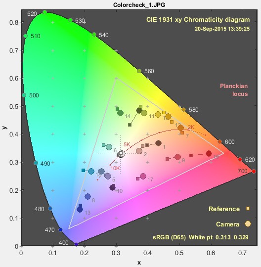
Is there an easy way to plot the colour difference between actual and target value in a chomaticity diagram? #1123
Unanswered
richardstardust
asked this question in
Q&A
Replies: 1 comment 1 reply
-
|
There's no one-liner to produce this type of plot but I've recently been working on something like this: Which can roughly be described with this code (Sorry these variables are out of my current working space, but you can probably fill in something more appropriate) from colour.plotting import (
plot_ellipses_MacAdam1942_in_chromaticity_diagram_CIE1976UCS,
)
from sklearn.cluster import KMeans
fig, ax = plot_ellipses_MacAdam1942_in_chromaticity_diagram_CIE1976UCS(
standalone=False, diagram_opacity=0.4, title="CIE u'v' (1976) Average Error"
)
for meas_color in measured_color_uvp:
plt.arrow(
target_color_uvp[idx, 0],
target_color_uvp[idx, 1],
(meas_color - target_color)[0],
(meas_color - target_color)[1],
facecolor=[1, 0.25, 0.15],
edgecolor=[0, 0, 0],
width=0.003,
linewidth=0.5,
)
plt.ylim(-0.02, 0.64)
plt.xlim(-0.02, 0.65)
ax.set_aspect(1) |
Beta Was this translation helpful? Give feedback.
1 reply
Sign up for free
to join this conversation on GitHub.
Already have an account?
Sign in to comment

-
Hi,

In Imatest it is easy to generate a colour difference plot for a colour calibration which is convenient.
The chromaticity diagram seems suitable but I am not sure how if there is built in functionality for this type of task in coulour-science or if it has to be done more manually?
Either way it would be great if somebody could explain how this is done in a good way or even share some example code.
Best regards,
Richard
Beta Was this translation helpful? Give feedback.
All reactions