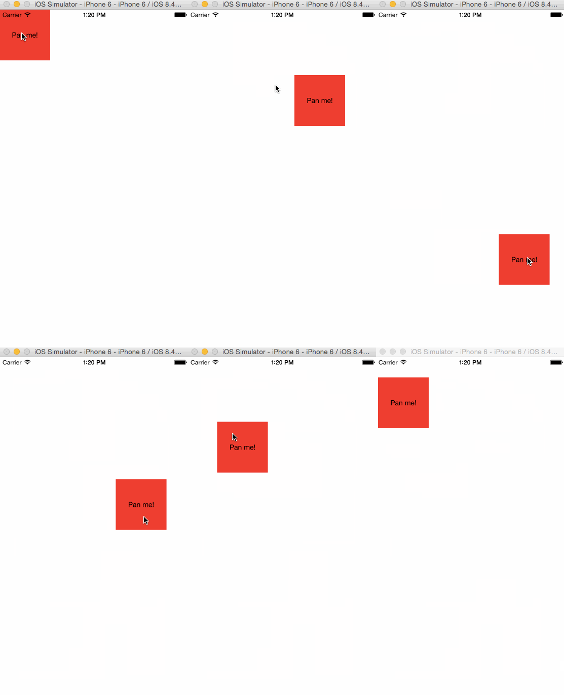
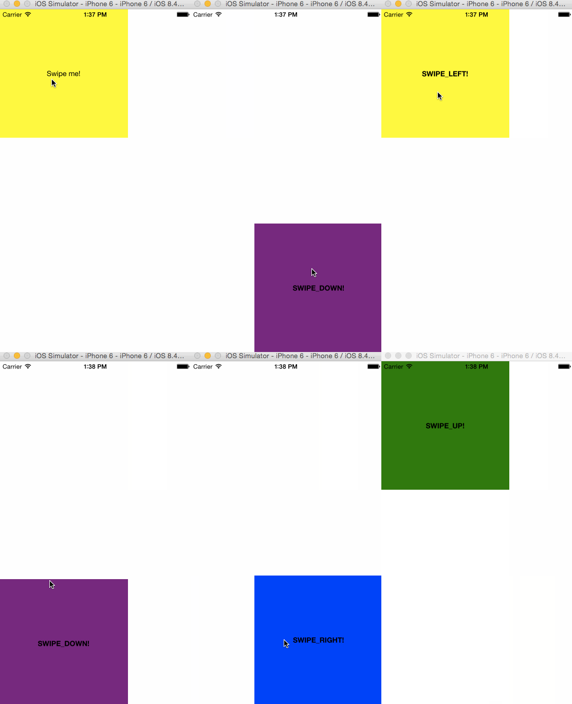
React Native gesture recognizer decorators. Just decorate your component and easily respond to pans and swipes!
Please report any issues you find!
Do an npm i react-native-gesture-recognizers and then try out one of the examples below!
import React, { Component, Text, View, Animated } from 'react-native';
import { pannable } from 'react-native-gesture-recognizers';

@pannable({
  setGestureState: false
})
class PanMe {

  render() {
    return (
      <View style={{width:100, height: 100, backgroundColor: 'red'}}>
        <Text>Pan me!</Text>
      </View>
    );
  }
}

class TransformOnPan extends Component {

  constructor(props, context) {
    super(props, context);
    this.state = {
      transform: new Animated.ValueXY(),
    }
  }

  onPan = ({ absoluteChangeX, absoluteChangeY }) => {
    this.state.transform.setValue({
      x: absoluteChangeX,
      y: absoluteChangeY,
    });
  }

  render() {
    const { transform } = this.state;

    return (
      // we transform the decorator instead of the decorated view,
      // so there won't be any issues with ghost panning,
      // due to the wrapping view staying in place and receiving touches
      <PanMe
        onPan={this.onPan}
        panDecoratorStyle={{transform: transform.getTranslateTransform()}} />
    );
  }
}import React, { Component, Text, View, LayoutAnimation } from 'react-native';
import { swipeable } from 'react-native-gesture-recognizers';
const { directions: { SWIPE_UP, SWIPE_LEFT, SWIPE_DOWN, SWIPE_RIGHT } } = swipeable;
@swipeable({
horizontal:true,
vertical: true,
continuous: false,
initialVelocityThreshold: 0.7
})
class SwipeMe {
render() {
const { swipe: { direction } } = this.props;
return (
<View style={{
width:250,
height:250,
alignItems: 'center',
justifyContent: 'center'}}>
{!direction ? <Text>Swipe me!</Text> : <Text style={{fontWeight:'700'}}>{direction}!</Text>}
</View>
);
}
}
class TransformOnSwipe extends Component {
constructor(props, context) {
super(props, context);
this.state = {
color: 'yellow',
x: 0,
y: 0,
}
}
onSwipeBegin = ({ direction, distance, velocity }) => {
let { x, y, color } = this.state;
// x and y values are hardcoded for an iphone6 screen
switch (direction) {
case SWIPE_LEFT:
x = 0;
color = 'yellow';
break;
case SWIPE_RIGHT:
x = 125;
color = 'blue';
break;
case SWIPE_UP:
y = 0;
color = 'green';
break;
case SWIPE_DOWN:
y = 417;
color = 'purple';
break;
}
LayoutAnimation.configureNext(LayoutAnimation.Presets.spring);
this.setState({
x, y, color
});
}
render() {
const { transform, reset, color, x ,y } = this.state;
return (
<SwipeMe
onSwipeBegin={this.onSwipeBegin}
swipeDecoratorStyle={{
backgroundColor: color,
left: x,
top: y,
position:'absolute',
}} />
);
}
}setGestureState Boolean
Whether the decorator should pass the current pan state to the decorated child. If you only use the callbacks to react to panning, then you can set this to false.
Default: true
onPanBegin({ originX, originY }) Function
Gets called once at the begin of the gesture.
onPan({ absoluteChangeX, absoluteChangeY, changeX, changeY }) Function
Gets called whenever the touch moves.
onPanEnd() Function
Gets called when the gesture is released or terminated. (The user ended the touch or it was forcefully interrupted)
panDecoratorStyle Object
A custom style object, which will be applied to the wrapper view.
resetPan Boolean
When true is passed, it will reset the state of the panning decorator. This can be useful if you want to reset the absolute change values, since these stay stored until you reset them.
setGestureState Boolean
Whether the decorator should pass the current pan state to the decorated child. If you only use the callbacks to react to panning, then you can set this to false.
horizontal Boolean
Whether horizontal swipes should be detected.
Default: false
vertical Boolean
Whether vertical swipes should be detected.
Default: false
left Boolean
Whether left swipes should be detected.
Default: false
right Boolean
Whether right swipes should be detected.
Default: false
up Boolean
Whether upward swipes should be detected.
Default: false
up Boolean
Whether downward swipes should be detected.
Default: false
continuous Boolean
If true, then you will receive an update each time the touch moves. If false you will only receive a single notification about the touch.
Default: true
initialVelocityThreshold Number
Defines the initial velocity necessary for the swipe to be registered.
Default: 0.7
verticalThreshold Number
Defines how far the touch can stray from the x-axis in y-direction when detecting horizontal touches.
Default: 10
horizontalThreshold Number
Defines how far the touch can stray from the y-axis in x-direction when detecting vertical touches.
Default: 10
onSwipeBegin({ direction, distance, velocity }) Function
Gets called once at the begin of the gesture.
onSwipe({ direction, distance, velocity }) Function
Gets called whenever the touch moves, if continuous is true.
onSwipeEnd({ direction }) Function
Gets called when the gesture is released or terminated. (The user ended the touch or it was forcefully interrupted)
swipeDecoratorStyle Object
A custom style object, which will be applied to the wrapper view.
- Allow combination of arbitrary gestures into a single decorator, in order to require less wrapping and being able to use gestures, which would interfere with each when claiming the responder status, side-by-side.

