| title | author | output |
|---|---|---|
Route factor loveliness |
Dan Olner |
html_document |
For my first foray into r-markdown (and getting that rmarkdown directly into a jekyll blog), let's have a go at getting a `route factor' from Google's route matrix API. I won't cover actually getting that data - have a look at that github link for information on how to do it, and a copy of the CSV result that's used here.
The 'route factor' is just the ratio of a route distance between two points over its Euclidean distance (or Great Circle equivalent, which is what I use here via the sp package). So if the distance to drive a route is twice as far as the crow flies, the route factor is 2. In modern parlance it's known as circuity (note the handy diagram in that link) though I first picked the idea up from this rather wonderful 1979 geography textbook and now can't stop calling it 'route factor'.
I'd originally harvested google distance data in order just to show that, if goods were moving between random points in the UK, the distribution would be clearly different from the spatial decay present in the 'goods lifted' data (it is). But it also provided a handy way to check circuity. (Sigh... it's shorter, isn't it? I should start using it!)
The data also offers the intriquing possibility of checking how circuity changes depending on the route distance. Intuitively, one would expect that shorter routes would be more wiggly and, for larger journeys, the ability to utilise more major roads would increase the efficiency. We'll take a look at that here.
I'll be using sp's spDist function to get the great-circle distance between points - in what seems like a clumsy way to me, so it'd be good to hear about better options.
So here we go. First, the libraries and data we're using...
{% highlight r %} library(sp) library(ggplot2) library(Hmisc)#for binning distances {% endhighlight %}
{% highlight r %} routes <- read.csv("latestrbindOfMatrixOutputs.csv") {% endhighlight %}
That's ~5.5 thousand routes between random points in Great Britain. We've got the following variables in 'routes' that Google's matrix API provides:
{% highlight r %} colnames(routes) {% endhighlight %}
{% highlight text %}
{% endhighlight %}
The API is cunning: in routesRandomiser.R, all I do is pick a completely random point within a shapefile for Great Britain and it picks the nearest actual address point - as you can see (using knitr's nice table formatting) from the 'origin' and 'destination' fields:
{% highlight r %} knitr::kable(head(routes[,5:6])) {% endhighlight %}
| origin | destination |
|---|---|
| 11 George Street, Hintlesham, Ipswich, Suffolk IP8 3NH, UK | Cholderton Road, Andover, Hampshire SP11, UK |
| B3223, Exmoor National Park, Minehead, Somerset TA24, UK | Unnamed Road, Lauder, Scottish Borders TD2 6PU, UK |
| B5027, Uttoxeter, Staffordshire ST14 8SG, UK | Unnamed Road, Ystrad Meurig SY25 6ES, UK |
| New Barn Drove, Warboys, Huntingdon, Cambridgeshire PE28 2UB, UK | Unnamed Road, Ripon, North Yorkshire HG4, UK |
| Gibbet Lane, Market Rasen, Lincolnshire LN8 3SD, UK | Unnamed Road, Pitlochry, Perth and Kinross PH9 0PA, UK |
| Unnamed Road, Charing, Ashford, Kent TN27, UK | Wolverstone Hill, Honiton, Devon EX14 3PU, UK |
So we know we're getting actual random network routes. We'll be using origin/destination lat/long coordinates (origin_x / origin_y and dest_x/dest_y) and, of course, distance - which needs converting to kilometres to match the upcoming sp function:
{% highlight r %} routes$distance <- routes$distance / 1000 {% endhighlight %}
For ease of reading, let's subset origin and destination coordinates.
{% highlight r %} origins <- data.matrix(subset(routes, select = c(origin_x, origin_y))) dests <- data.matrix(subset(routes, select = c(dest_x, dest_y))) {% endhighlight %}
And I'll be adding the resulting great-circle distances back into 'routes', so:
{% highlight r %} routes$spDist <- 0 {% endhighlight %}
Now for the bit doing the work. The spDistsN1 function is actually set up to find a full vector of distances between a single point and a bunch of other points. I couldn't find a less tidy way to persuade it to give me distances between a sequence of pairs. Here's what I managed. Cycle through each of the 'origins' and use that as the matrix of points it wants (it just happens to be a single point in this case, but it needs to be passed in as a matrix). The destination can then just be the single point. 'longlat=TRUE' returns kilometre great-circle distances.
{% highlight r %} for (i in 1:nrow(origins)) {
#get a single pair, turn into matrix for spDistsN1 #needs transposing also. R matrix/dataframe orientation confuses me! If it doubt, hit it until it works. orig <- t(data.matrix(origins[i,])) #spDistN1: first arg needs to be a matrix of points. Supplying it with a single-row matrix #Second argument has to be a single point. #If the first arg had more values it would find all dists between each of those and the single point #But we only want each origin-destination pair distance #http://rpackages.ianhowson.com/rforge/sp/man/spDistsN1.html routes$spDist[i] <- spDistsN1(orig,dests[i,], longlat=TRUE)
} {% endhighlight %}
Right - we have our straight(ish)-line distances to compare to Google's road network distances. Route factor ahoy! I'm going to also find route-factor-over-one, which will make sense in a moment.
{% highlight r %} #The ratio means "how much further is route distance than Euclidean/Great Circle?" routes$rf <- routes$distance/routes$spDist #"how much shorter is euclidean?" routes$rfoverone <- routes$spDist/routes$distance {% endhighlight %}
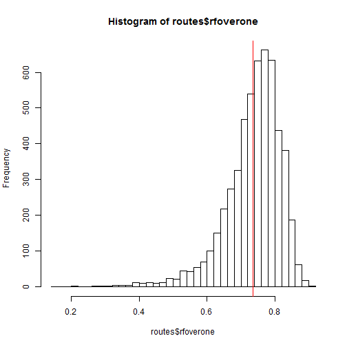
We can get a decent graph of the route factor, but the direct numbers are much more amenable to a histogram if we're asking "how much shorter is Euclidean distance?" Thusly:
{% highlight r %} hist(routes$rfoverone, breaks=30) abline(v=mean(routes$rfoverone),col="red") {% endhighlight %}
So - how does circuity change for the size of journey taken? To find out, let's make a function that will stick a range of distances into bins of equal sizes, so we can easily show the different that the number of bins makes. "Cut2" does the binning, providing an index we can use.
{% highlight r %} rfbins <- function(data, bins) {
data$distbins <- as.numeric(cut2(data$spDist, g=bins))

#vectors of zeroes for the means
distmean <- rep(0,bins)
rfmean <- rep(0,bins)

rfhypo <- data.frame(distmean, rfmean)

#Use these bins to get average distance...
rfhypo$distmean <- tapply(data$spDist, data$distbins, mean)
#... and average route factor
rfhypo$rfmean <- tapply(data$rf, data$distbins, mean)

return(rfhypo)
} {% endhighlight %}
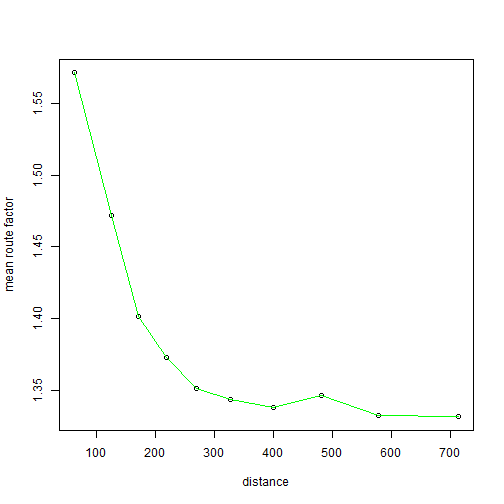
This function gives us the average distance for route and great-circle distance in the same, equal-size bins ("g" in the cut2 functions splits into equally-sized quantiles). From which we can get:
{% highlight r %} rfhypo <- rfbins(routes, 10)
plot(rfhypo, xlab="distance", ylab="mean route factor") lines(rfhypo, col="green") {% endhighlight %}
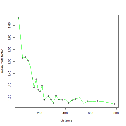
Boom! Circuity is higher for shorter distances. For higher bin numbers, though, the drop-off isn't quite so smooth.
{% highlight r %} rfhypo <- rfbins(routes, 30)
plot(rfhypo, xlab="distance", ylab="mean route factor") lines(rfhypo, col="green") {% endhighlight %}
A few thoughts to end on.
- In comparison to some of the circuity numbers quoted in that wikibooks entry, this route factor looks rather high. It makes me fret about coordinate systems. I'm pretty sure the original data is lat-long, but... yes, worth a sanity check. The article does mention two points, though:
- "The measure has also been considered by Wolf (2004) using GPS traces of actual travelers route selections, finding that many actual routes experience much higher circuity than might be expected."
- "Levinson and El-Geneidy (2009) show that circuity measured through randomly selected origins and destinations exceeds circuity measured from actual home-work pairs. Workers tend to choose commutes with lower circuity, applying intelligence to their home location decisions compared to their work."
- The randomness in the Google matrix API routes will also mean many short distances in non-urban areas, where I'd expect circuity to be much higher (something that should actually be easy enough to test). Though that wouldn't explain it bottoming out at a rather high ~1.35.
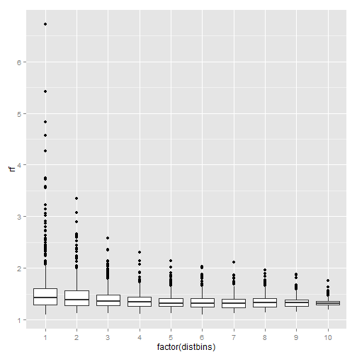
One last graph: the distribution of circuity in each of the bins shows a little more what's going on, certainly at shorter distances. Let's add the bins directly to the original routes data to see:
{% highlight r %} bins = 10
routes$distbins <- as.numeric(cut2(routes$spDist, g=bins))
ggplot(routes, aes(factor(distbins), rf)) + geom_boxplot() {% endhighlight %}
Whoo - some outliery craziness going on there. Route factor of more than six, you say? Ah, that'd be this. Despite having asked the API "avoid=ferries", it appears to be taking some routes across the sea by car. So a closer look at the data perhaps required. Restricting random routes to England and Wales might also be an idea.
So there we are, first rmarkdown experiment over. That was quite pleasing if rather time-consuming. The process certainly couldn't be easier though. (I've said that before attempting to transfer to Jekyll. Let's see how that goes...)
Jekyll note: as I didn't have one, I nabbed this syntax highlight stylesheet via here.


