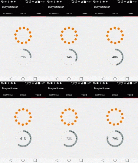
The BusyIndicator is a progress indicator with determined and indeterminate state.
dependencies {

...

    compile 'com.silverforge.controls:busyindicator:1.1.0'
}
Please do not hesitate to raise any issue you find related to BusyIndicator here
Copyright 2015 Janos Murvai-Gaal

Licensed under the Apache License, Version 2.0 (the "License");
you may not use this file except in compliance with the License.
You may obtain a copy of the License at

    http://www.apache.org/licenses/LICENSE-2.0

Unless required by applicable law or agreed to in writing, software
distributed under the License is distributed on an "AS IS" BASIS,
WITHOUT WARRANTIES OR CONDITIONS OF ANY KIND, either express or implied.
See the License for the specific language governing permissions and
limitations under the License.
You can control the busyindicator behavior or look & feel with the following attributes:
- bigpoint_color - The foreground color of the points (circles) on outer radius. By default it is gray.
- smallpoint_color - The foreground color of the point (circle) on the inner radius. By default it is black.
- bigpoint_count - The count of points (circles) on outer radius. By default it is 4. (Range is integer between 4 and 20)
- background_is_visible - true of false. If true you have a light gray rectangle background with rounded corner by default .
- background_color - The background color if visible. By default it is light gray.
- background_shape - The shape of background. (Values could be either rounded_rectangle or circle)
- angle_modifier - The speed multiplicator of the busy indicator. By default it is 1. (Range is integer between 1 and 3)
All of the attributes mentioned in previous section plus
- infinite - true of false. If true the busyindicator is active otherwise the load indicator is active.
- percentage_is_visible - true of false. If true the percentage text appears.
- percentage_decimal_places - Could be : [0, 1, 2]. The decimal places of the percentage text.
- max_value - The max value of the progress.
- stroke_width_multiplier - The width multiplicator of the indicator. (Range is float between 0.2F and 14F)
- load_points_are_visible - true or false. If true the outer points are visible otherwise they are hidden.
- indicator_alpha - The indicator color alpha. By default it is 100. (Range is integer between 100 and 255).
<com.silverforge.controls.BusyIndicator
    app:angle_modifier="3"
    app:background_is_visible="true"
    app:background_color="@color/dark_background"
    app:bigpoint_color="@color/dark_bigpoint"
    app:smallpoint_color="@color/dark_smallpoint"

    android:layout_width="300dp"
    android:layout_height="150dp"
    android:layout_margin="10dp"
/><com.silverforge.controls.BusyIndicator
android:id="@+id/finiteRectangleBusyIndicator"
app:background_is_visible="true"
app:background_shape="rounded_rectangle"
app:background_color="@color/dark_background"
app:bigpoint_color="@color/dark_bigpoint"
app:smallpoint_color="@color/dark_smallpoint"
app:bigpoint_count="20"
app:infinite="false"
app:max_value="100"
app:percentage_is_visible="true"
app:percentage_decimal_places="1"
app:load_points_are_visible="false"
android:layout_width="300dp"
android:layout_height="150dp"
android:layout_margin="10dp"
/><com.silverforge.controls.BusyIndicator
android:id="@+id/infiniteCircleBusyIndicator"
app:background_is_visible="true"
app:background_shape="circle"
app:background_color="@color/light_background"
app:bigpoint_color="@color/light_bigpoint"
app:smallpoint_color="@color/light_smallpoint"
android:layout_width="150dp"
android:layout_height="150dp"
android:layout_margin="10dp"
/><com.silverforge.controls.BusyIndicator
android:id="@+id/finiteCircleBusyIndicator"
app:background_is_visible="true"
app:background_shape="circle"
app:background_color="@color/light_background"
app:bigpoint_color="@color/light_bigpoint"
app:smallpoint_color="@color/light_smallpoint"
app:bigpoint_count="20"
app:infinite="false"
app:max_value="100"
app:percentage_is_visible="true"
app:percentage_decimal_places="2"
app:stroke_width_multiplier="14"
android:layout_width="150dp"
android:layout_height="150dp"
android:layout_margin="10dp"
/><com.silverforge.controls.BusyIndicator
app:bigpoint_color="@color/trans_bigpoint"
app:smallpoint_color="@color/trans_smallpoint"
android:layout_width="300dp"
android:layout_height="150dp"
android:layout_margin="10dp"
/><com.silverforge.controls.BusyIndicator
android:id="@+id/finiteTransBusyIndicator"
app:bigpoint_color="@color/trans_bigpoint"
app:smallpoint_color="@color/trans_smallpoint"
app:bigpoint_count="20"
app:infinite="false"
app:max_value="100"
app:percentage_is_visible="true"
app:percentage_decimal_places="0"
app:stroke_width_multiplier="0.8"
android:layout_width="300dp"
android:layout_height="150dp"
android:layout_margin="10dp"
/>Basically just set the maxValue() of busyIndicator and after that set the current value via setValue() frequently like the // NOTE indicates in the code below.
Note : You can set the maxValue with xml attribute as well like app:max_value="756"
For example if you have a progress from 0 to 756, you just set maxValue() to 756 and via setValue() inform the busyIndicator about the progress. BusyIndicator will do the percentage calculations.
        busyIndicator = (BusyIndicator) findViewById(R.id.finiteBusyIndicator);

        // NOTE : Set the maximum value
        busyIndicator.setMaxValue(102);

        new BusyIndicatorAsyncTask().execute();

...

    class BusyIndicatorAsyncTask extends AsyncTask {
        @Override
        protected Object doInBackground(Object[] params) {

            for (int i = 0; i <= 102; i += 3) {
                final int a = i;
                runOnUiThread(new Runnable() {
                    @Override
                    public void run() {

                        // NOTE : You can set the current value of BusyIndicator
                        busyIndicator.setValue(a);
                    }
                });

                try {
                    Thread.sleep(1000);
                } catch (InterruptedException e) {
                    e.printStackTrace();
                }
            }

            return null;
        }
}Actualy it's simple, you can set the angle modifier via setAngleModifier() method at any time. The busy indicator immediately changes the speed once you set it.
    class InfiniteBusyModifier extends AsyncTask {
        @Override
        protected Object doInBackground(Object[] params) {
            final Random rand = new Random();

            FragmentActivity activity = getActivity();

            while (true) {
                final int a = rand.nextInt(3) + 1;

                activity.runOnUiThread(new Runnable() {
                    @Override
                    public void run() {

						// NOTE : You can set the speed
                        infiniteCircleBusyIndicator.setAngleModifier(a);
                    }
                });

                try {
                    Thread.sleep(1000);
                } catch (InterruptedException e) {
                    e.printStackTrace();
                }
            }
        }
    }


