On this page I'm plotting the spanish covid information gathered from the official Spanish Government's website. For this I'm automatically downloading the files published here: https://www.mscbs.gob.es/profesionales/saludPublica/ccayes/
Then, a script extracts the table from the first page and adds it to a pandas data frame. Finally, plotly is being used to generate the output charts and HTML.
The result can be foudn here: Spanish Covid Data
Ever wanted to get the road network of a city, a country or some other region in the world? This project might help you to do this faster by providing a simple way to parse an Open Street Map (OSM) file and generate a simple structured graph file.
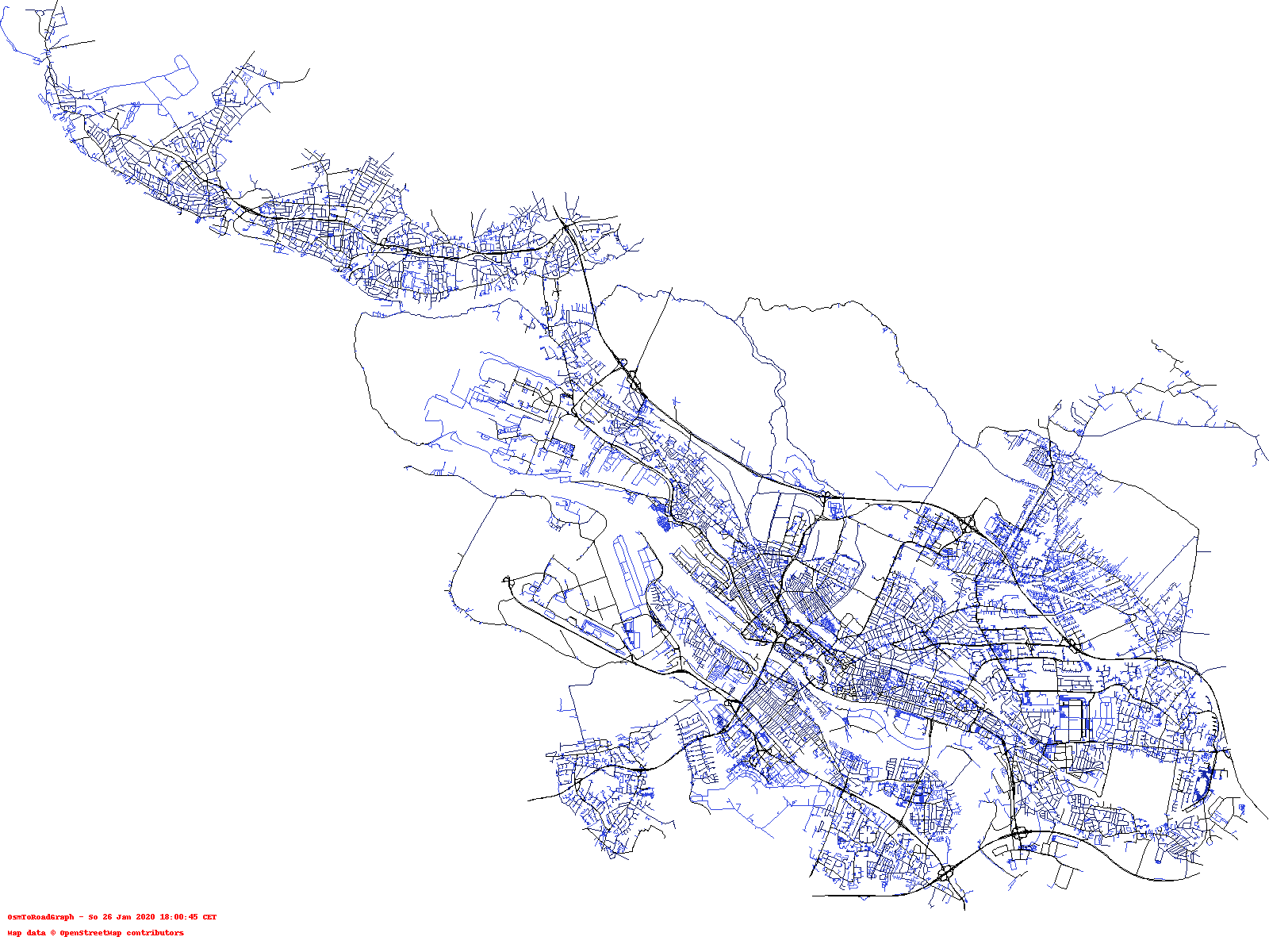
One example of what can be done with the output of this script is to use the processed data to generate a visualization. In the picture below, you can see the road network of the city of Bremen, Germany.
The color indicates the maximum speed a car is allowed to drive (the darker, the higher this maximum is):
For a description on how this can be done, please take a look here.
